
Citron Indonesia Foundation is an institution that focuses on the fields of IT, religion, and social education. Founded on October 14, 2015/1 Muharam 1437 H. Beginning with a simple concept and study, which is to create ICT experts (communication and information technology) focused on the field of software engineering or graphic design.
COMPANY
Citron Indonesia Foundation
INDUSTRY
Philanthropic Institutions
YEAR
2018
SERVICE DELIVERED
Brand Identity
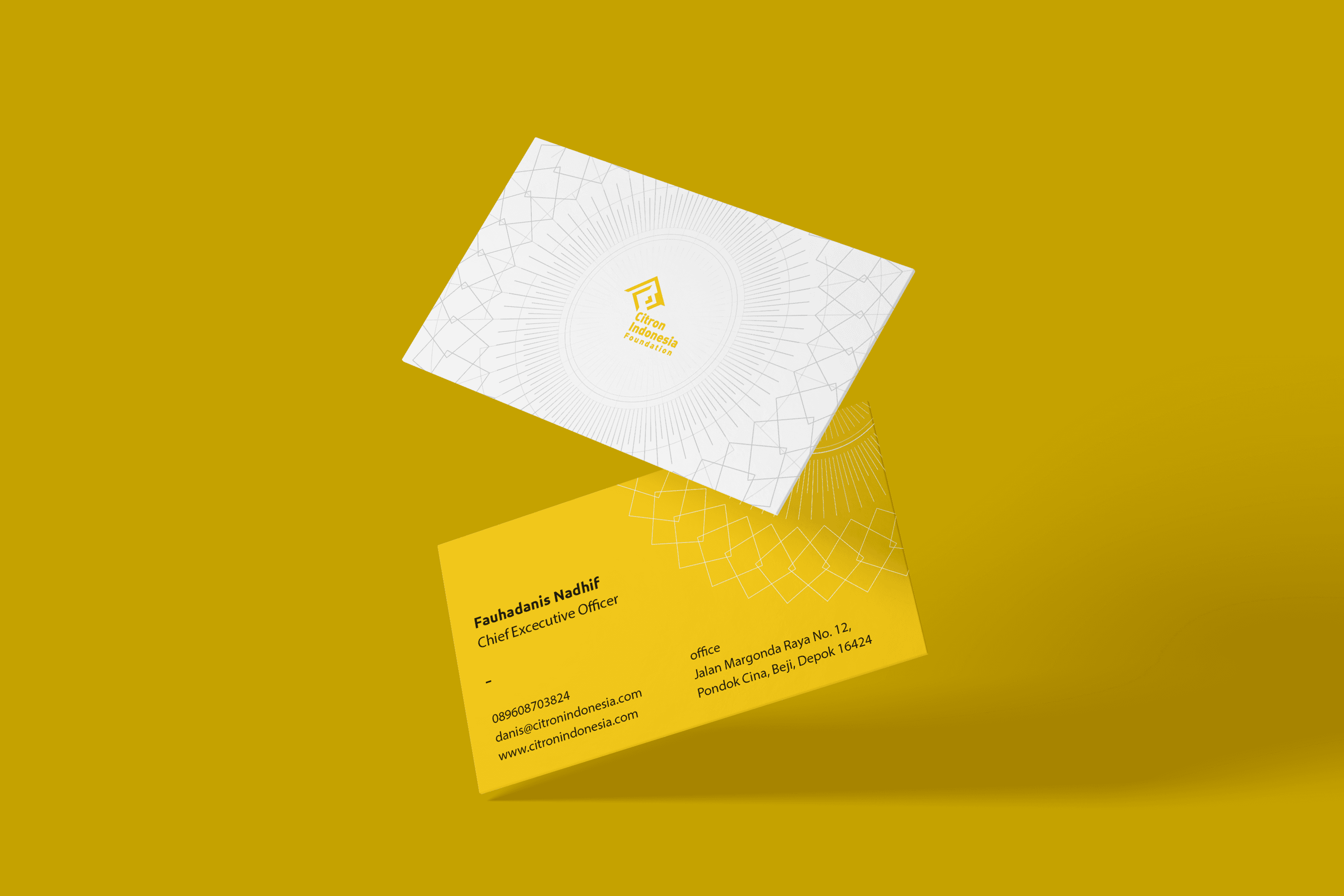
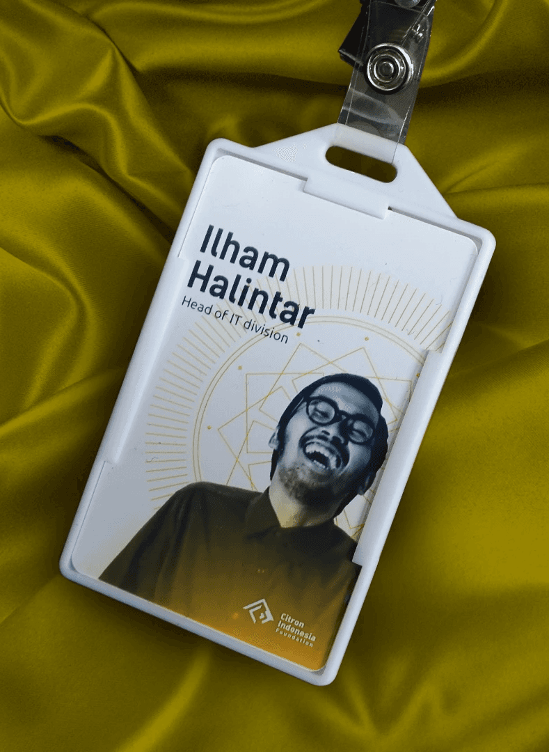
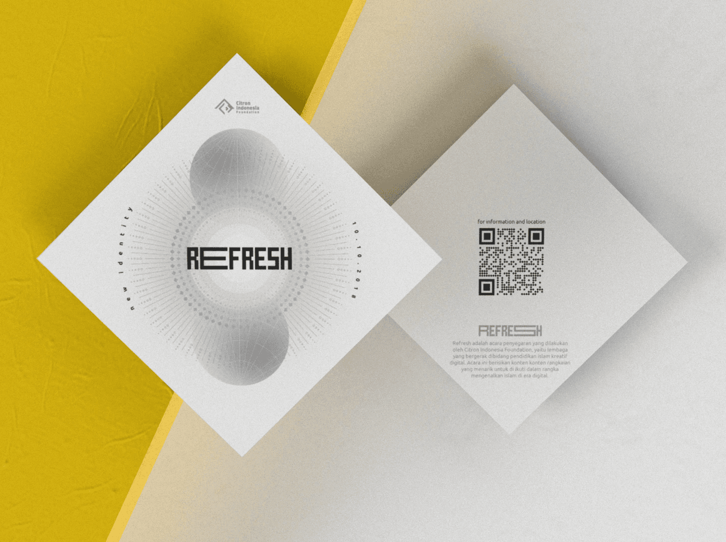
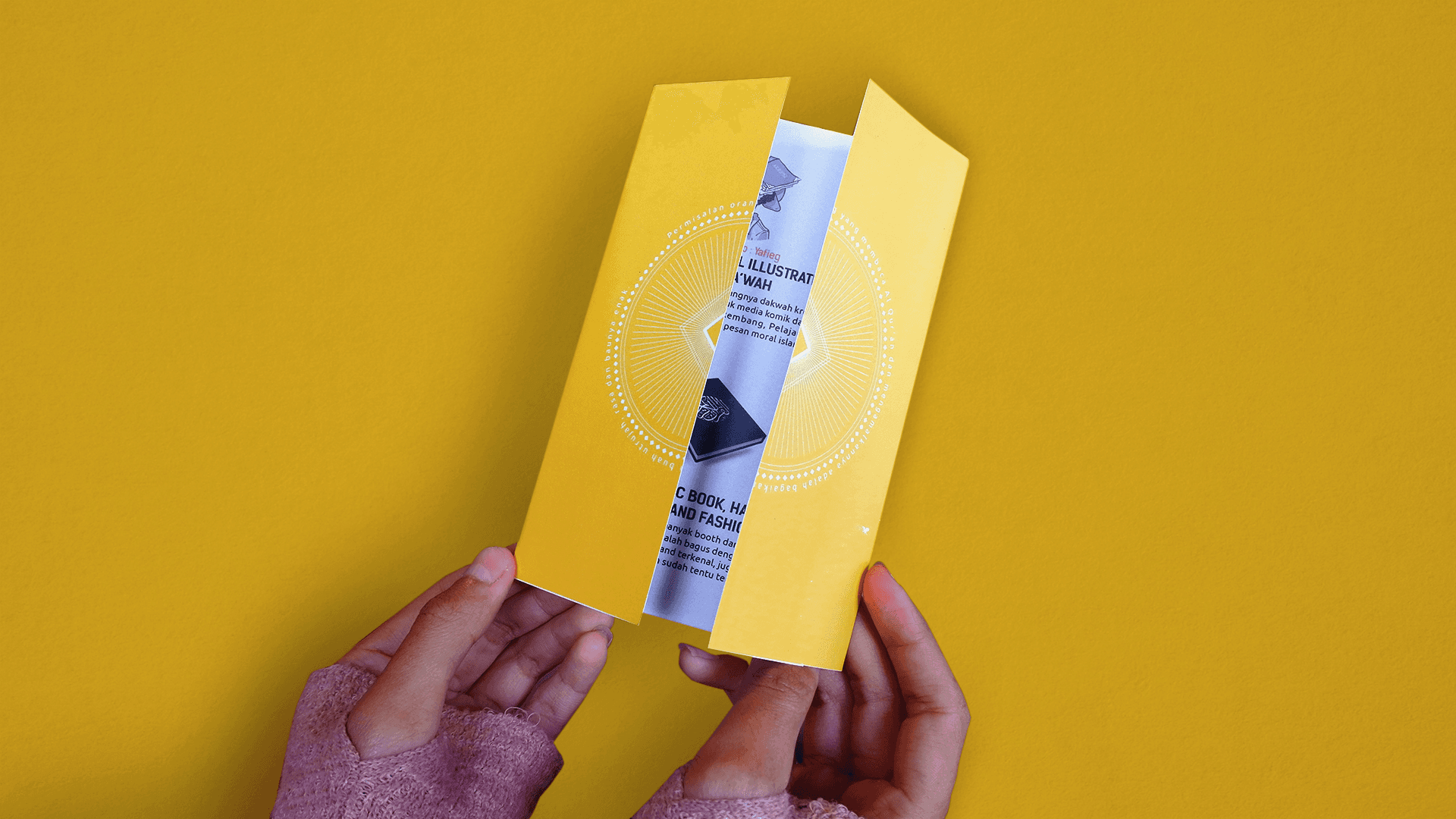
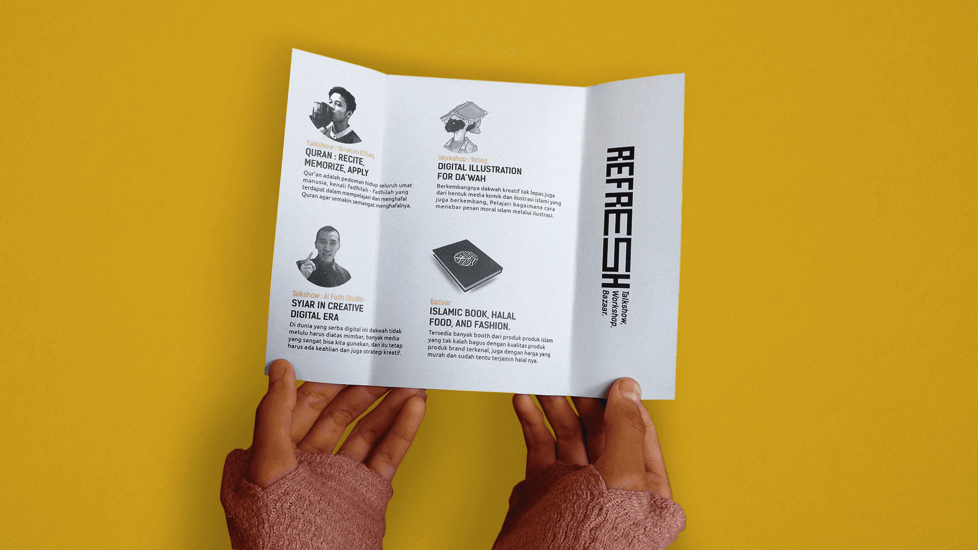
Stationary
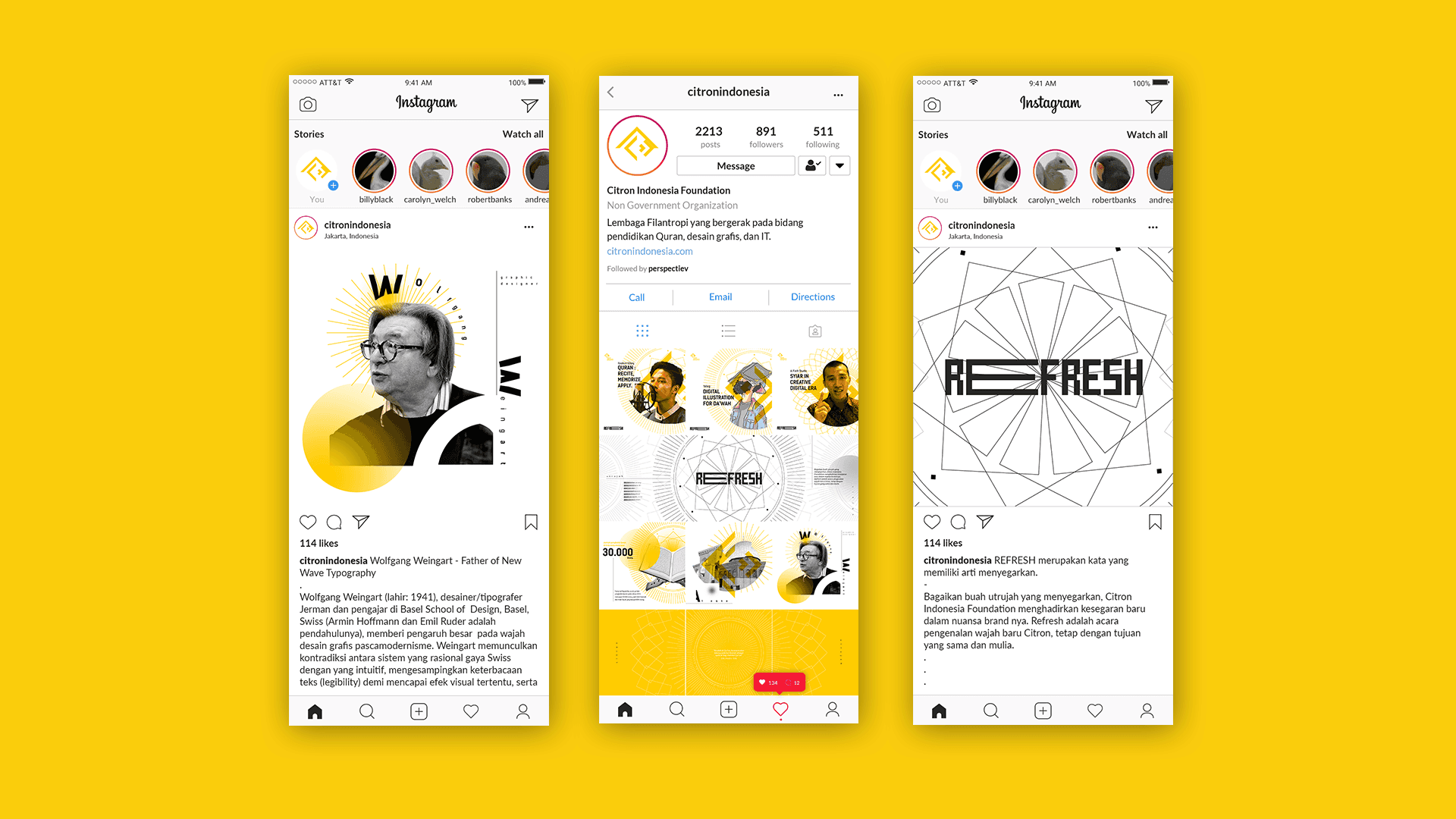
Social Media
Campaign
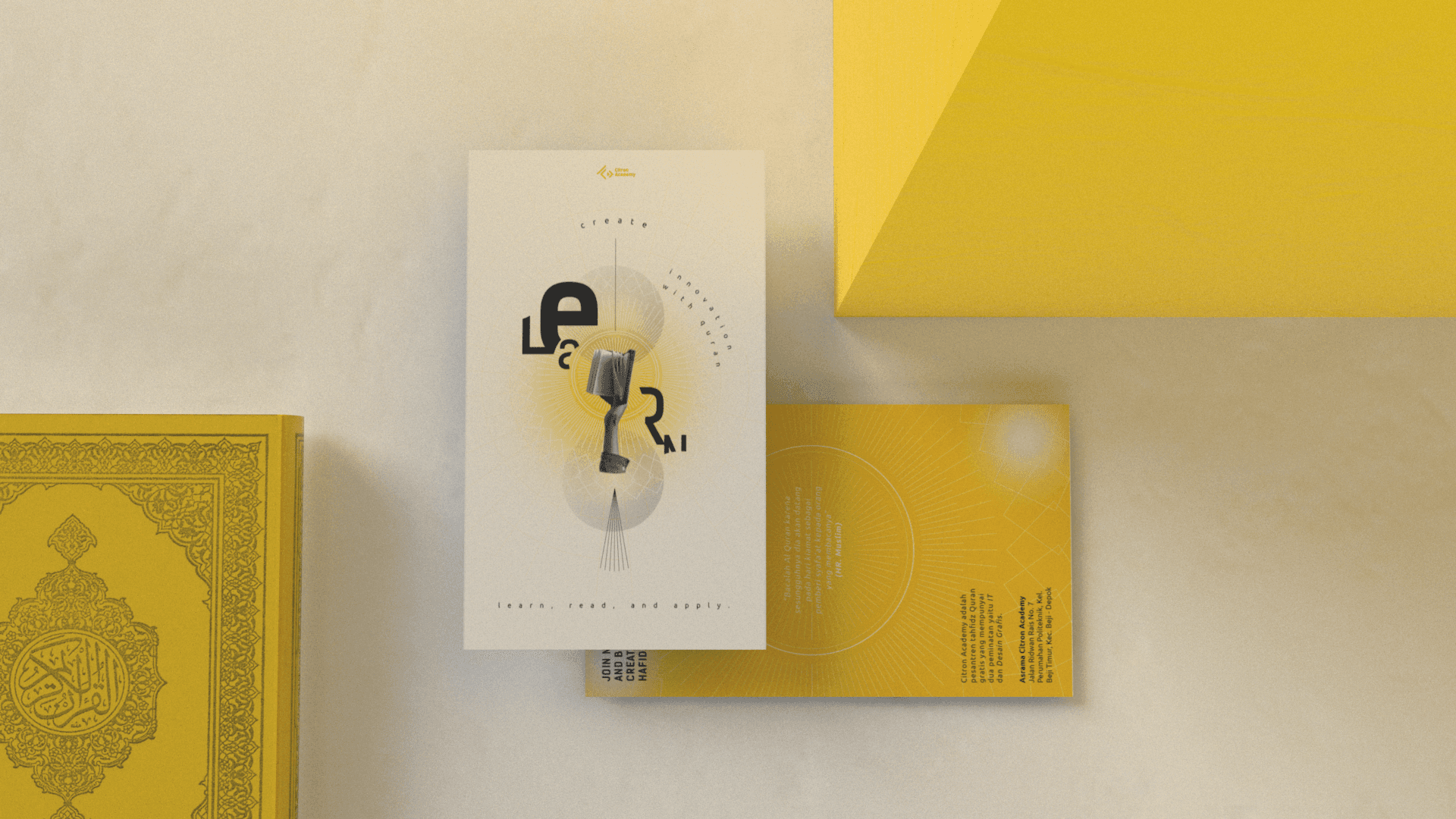
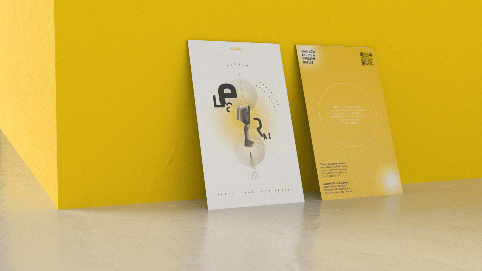
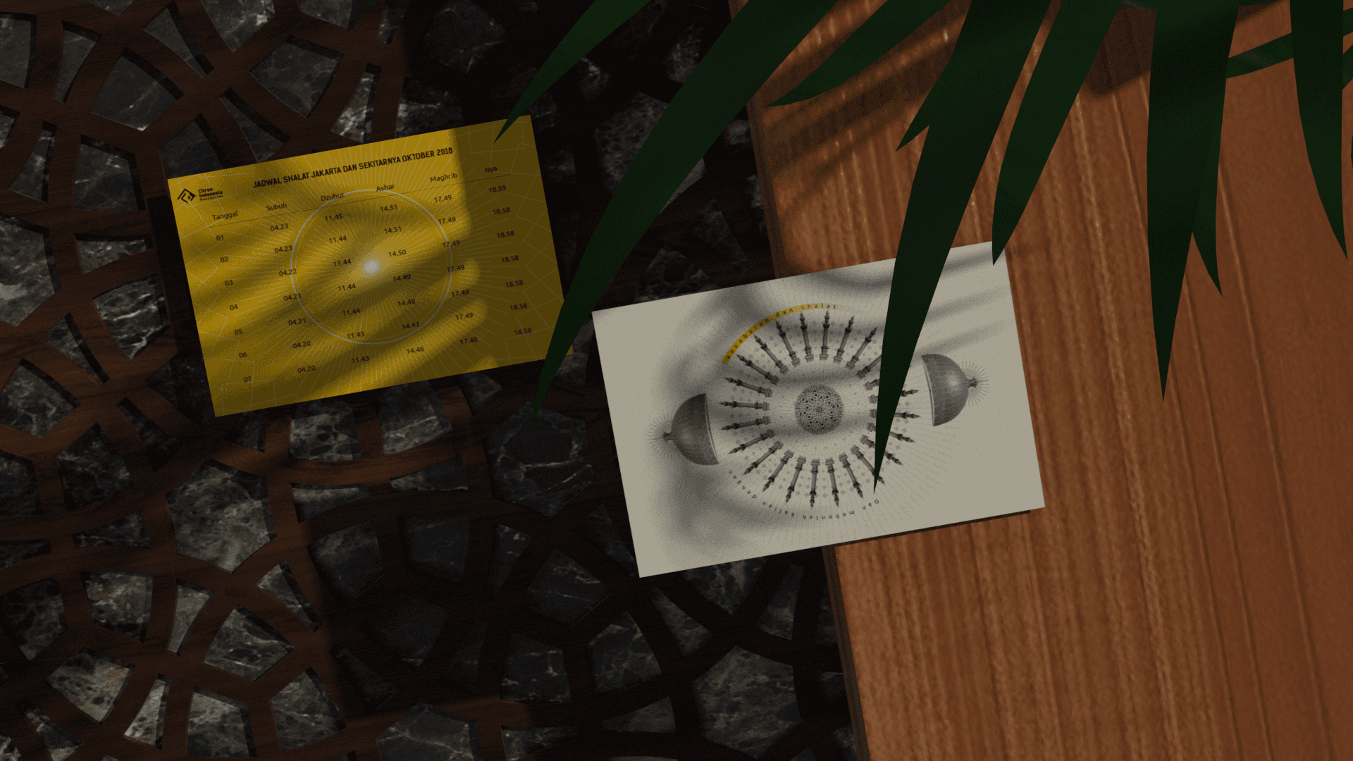
The Citron Indonesia Foundation initially operated as a philanthropic organization with a primary focus on one program, Citron Academy – a modern Quranic boarding school that integrates IT and design education for its students. However, as Citron expanded, they expressed their intention to diversify into various other products. Thus, a new identity was needed to represent their growing range of offerings. In this project, I endeavored to create a brand identity that could effectively portray and represent each program that Citron aimed to establish.
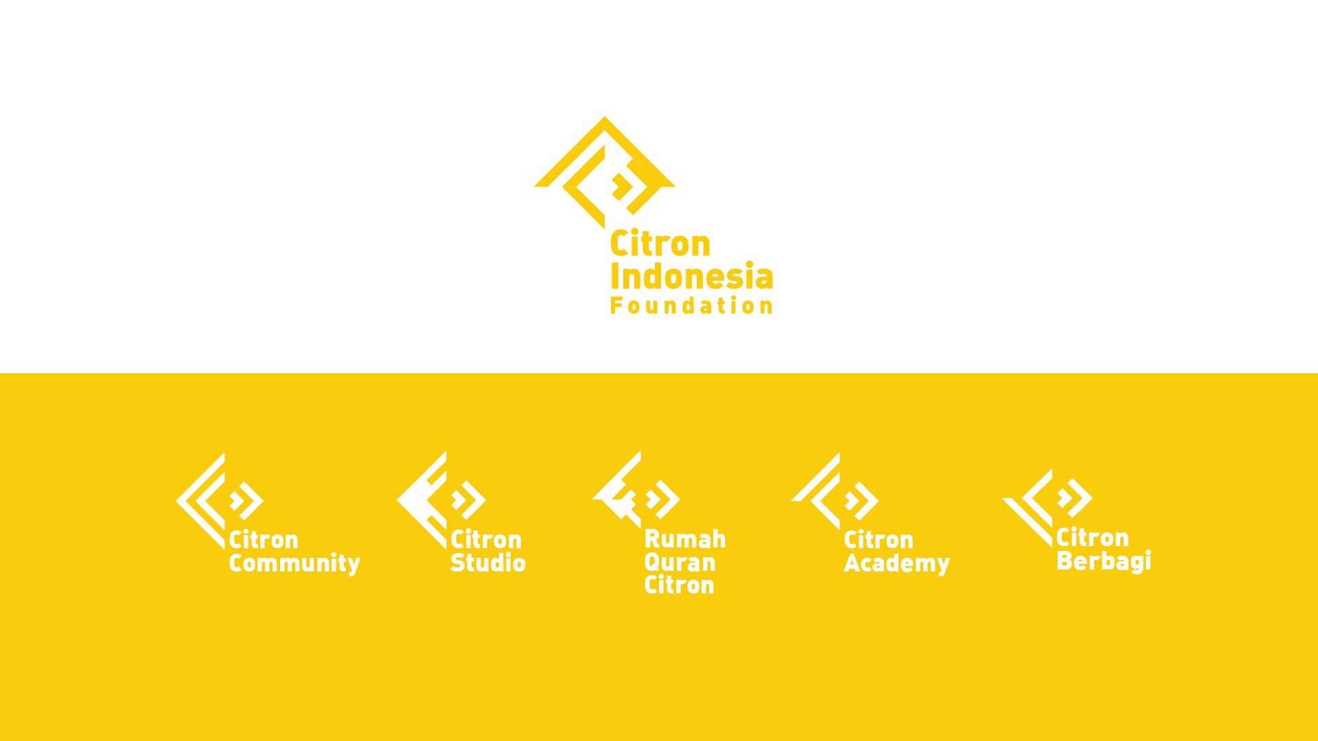
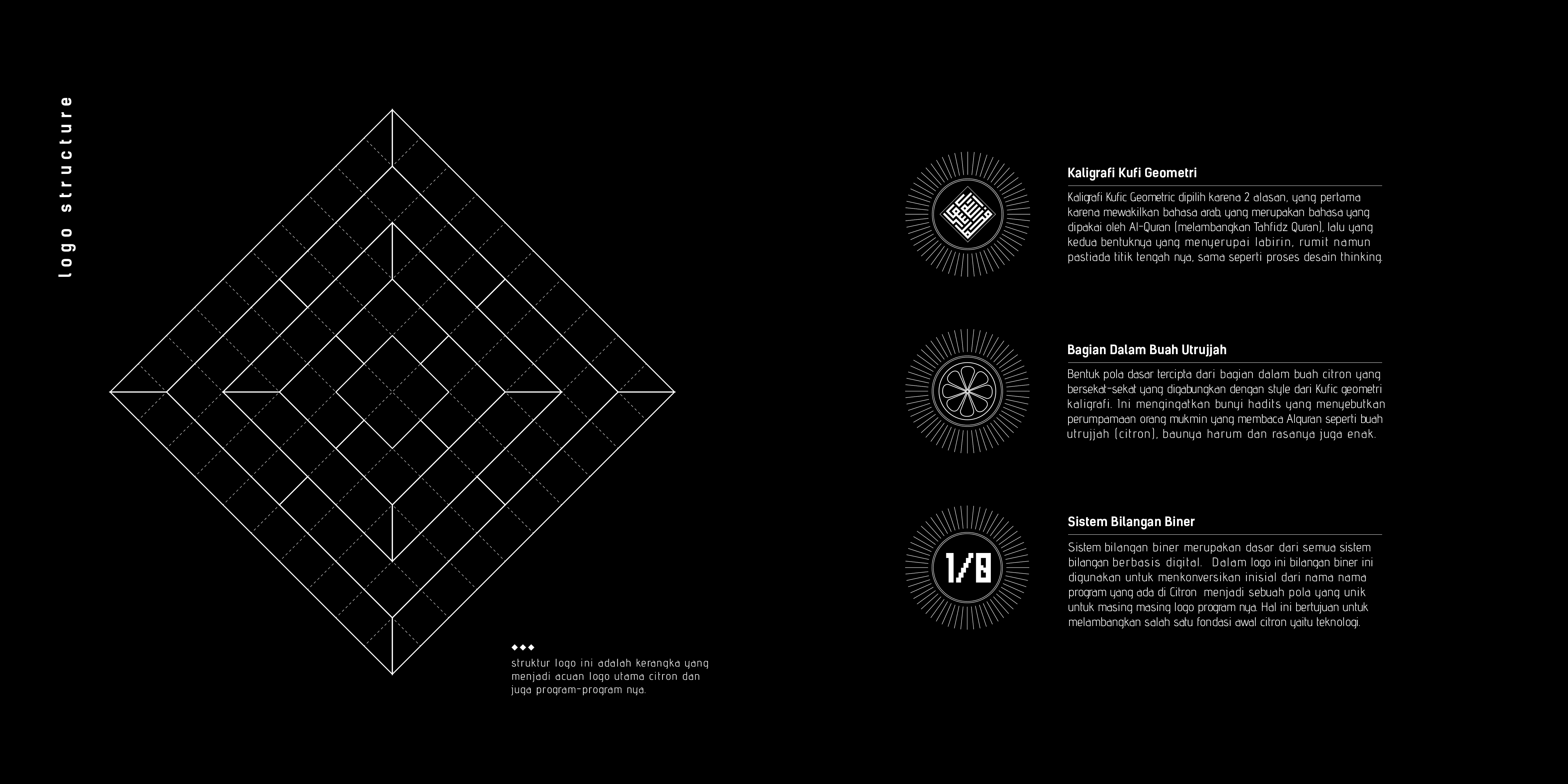
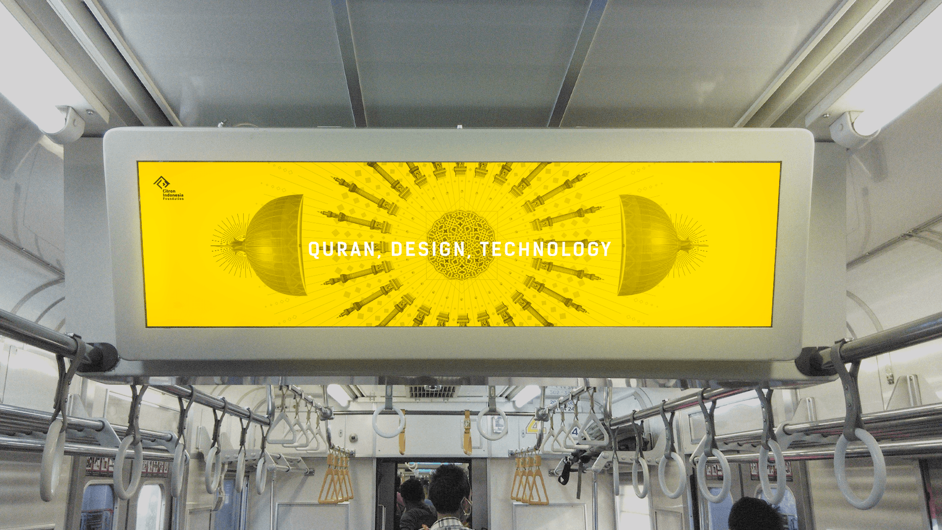
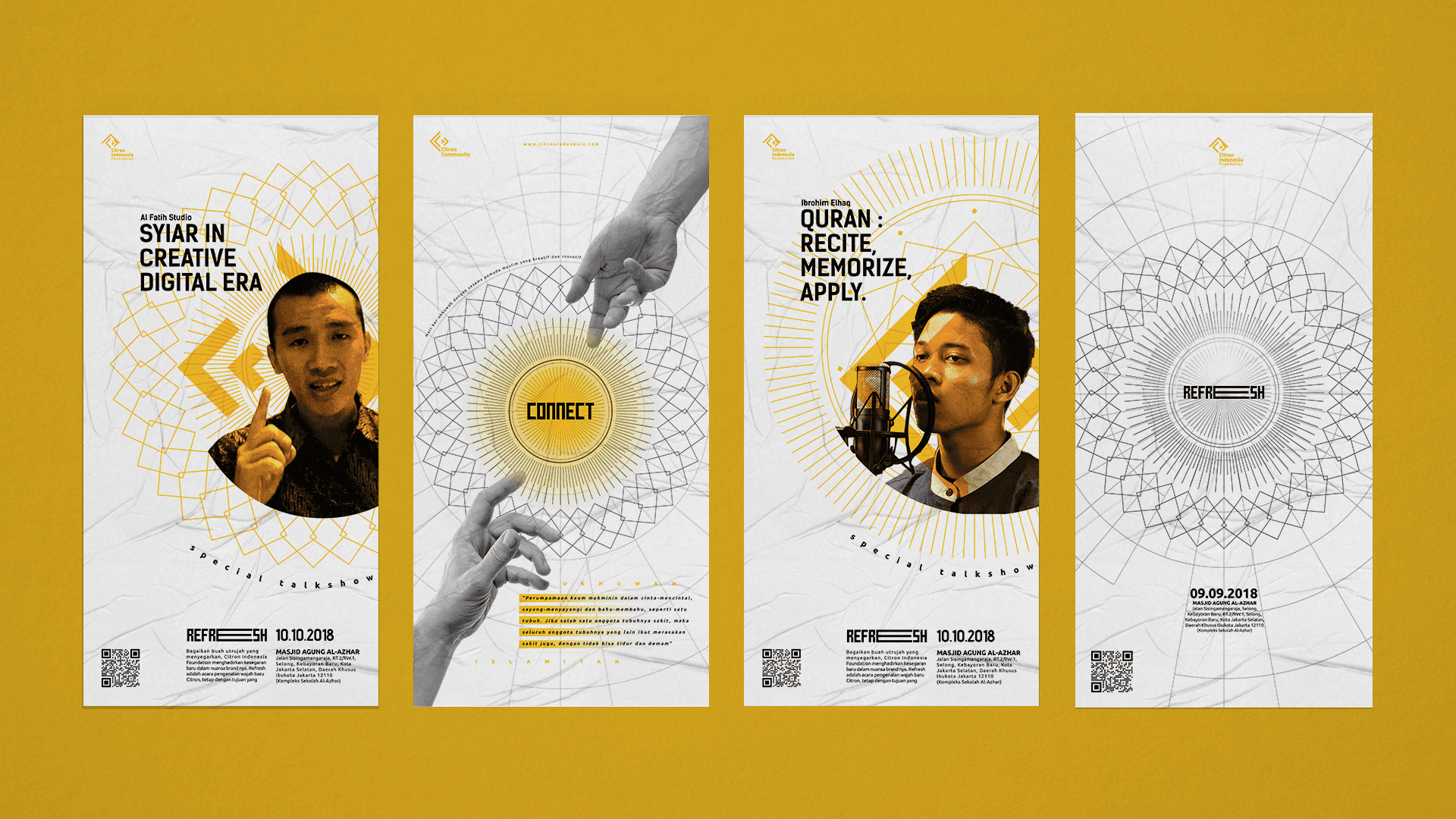
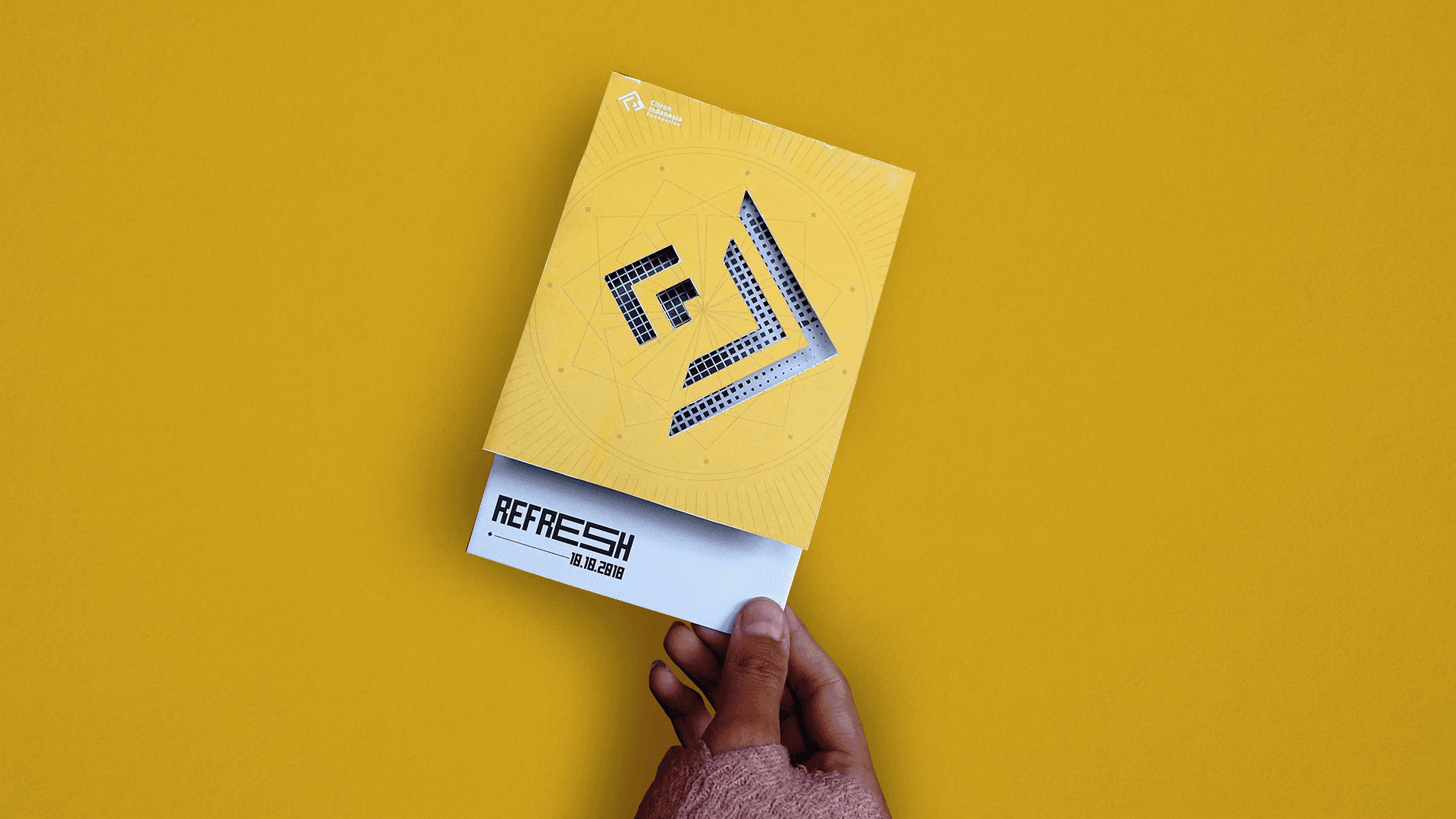
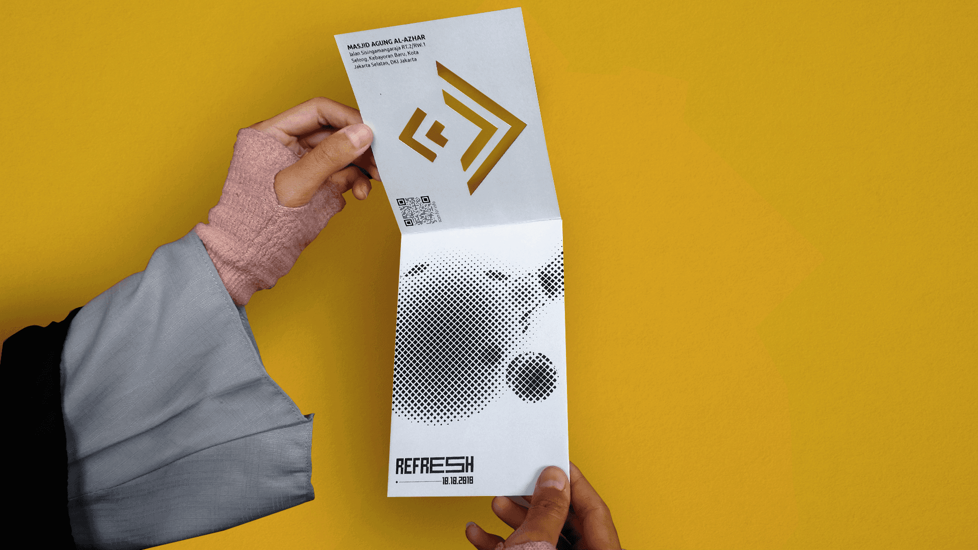
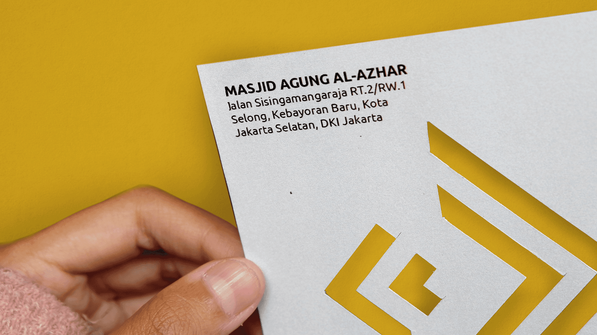
The Dynamic Logo Inspired by Kufi and Binary Numbers
Initially, I explored several logo alternatives, ultimately arriving at a dynamic logo concept. This logo draws inspiration from Kufi calligraphy, forming a labyrinth-like pattern to symbolize the Quran and creativity. Simultaneously, the pattern is an abstract representation resulting from the configuration of the initial letters of Citron's programs, translated into binary numbers. For example, if Citron Academy has the initials CA, where C=01100011 and A=01000001, these binary values are translated into a basic logo form, where '1' represents fill, and '0' represents blank spaces. This configuration generates a unique abstract shape for each of the program names."
Like the Utrujah Fruit
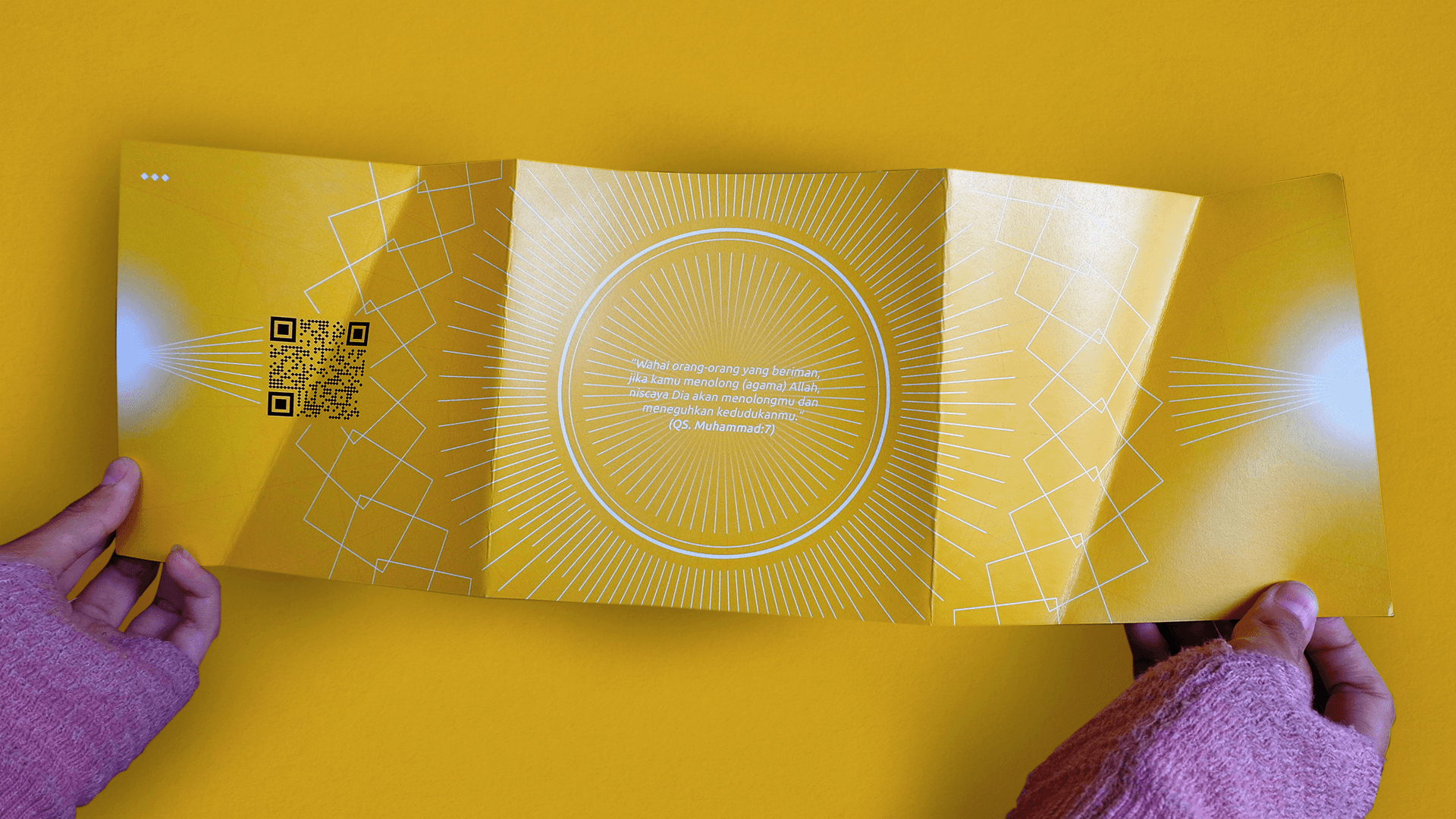
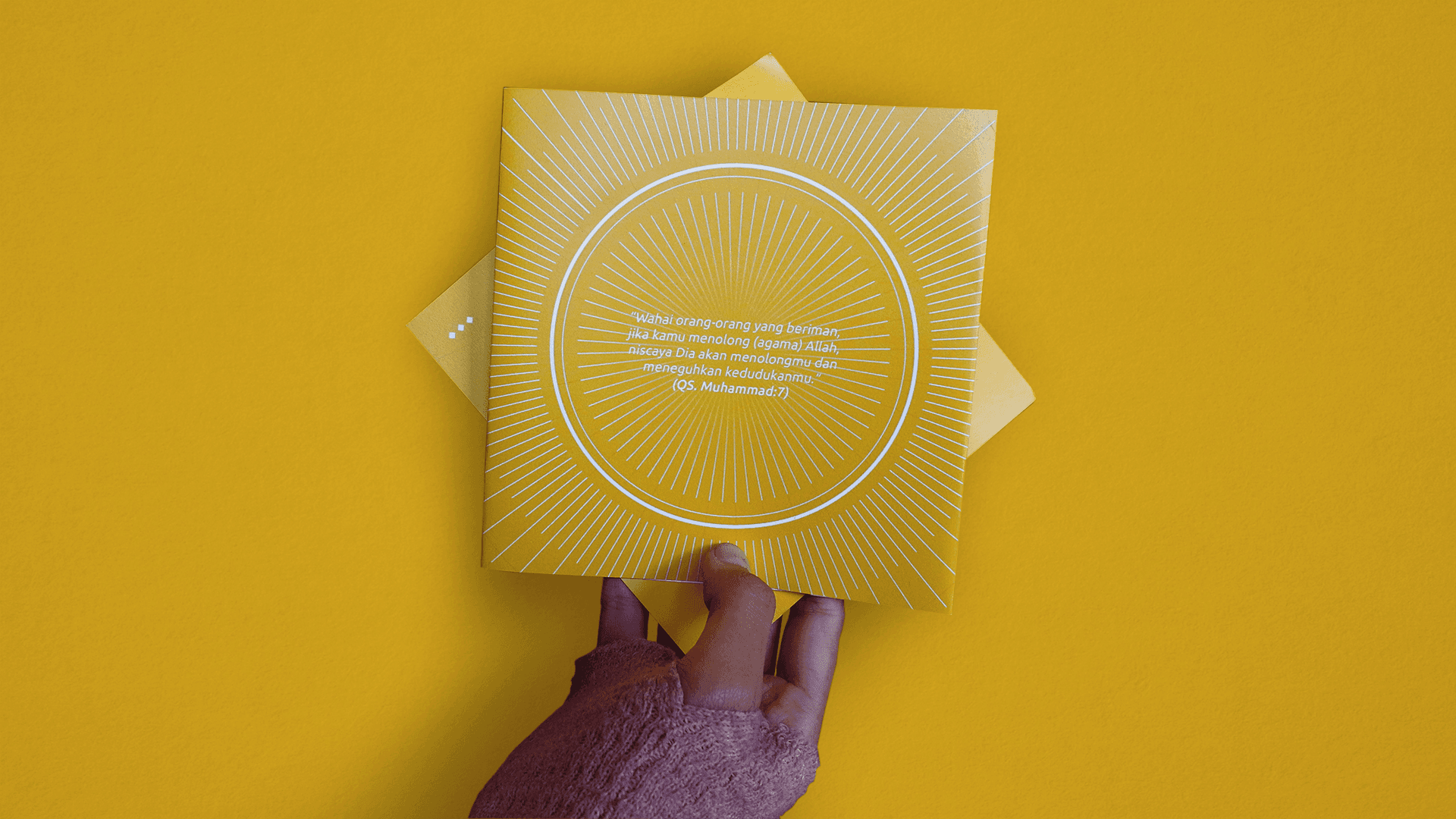
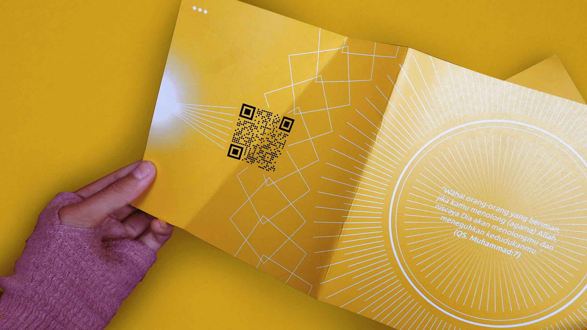
The yellow color in the logo is inspired by the hue of the Utrujah fruit (utrujah is citron in arabic), which was the driving force behind the establishment of Citron Indonesia Foundation. As it is written, 'The similitude of those who read the Qur'an and practice it is like the Utrujah, sweet in taste and fragrance. The believer who reads and acts upon the Qur'an is like the Utrujah. The hypocrite who reads the Qur'an is like sweet basil, fragrant but bitter in taste. The hypocrite who does not read the Qur'an is like the colocynth (a bitter desert fruit), both in taste and fragrance.' (Hadith - Sahih al-Bukhari, no. 5059). Additionally, the color yellow symbolizes the knowledge and creativity that are the cornerstones of Citron Indonesia Foundation."
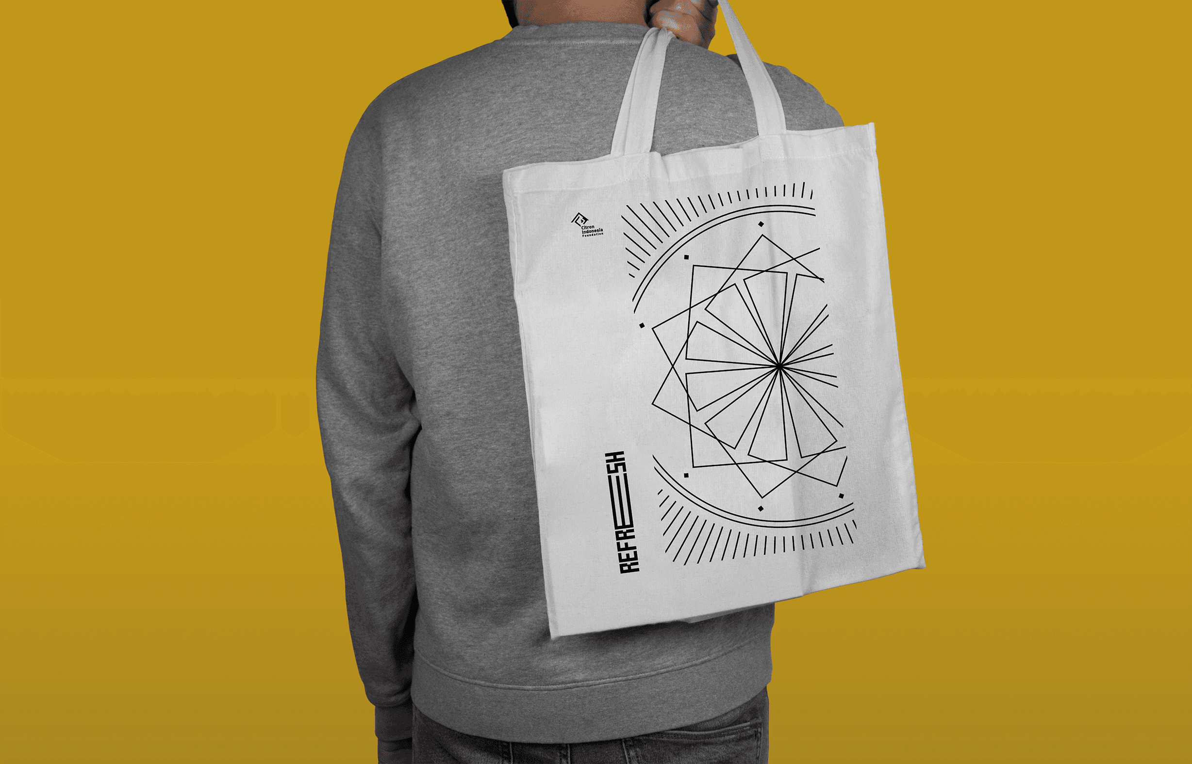
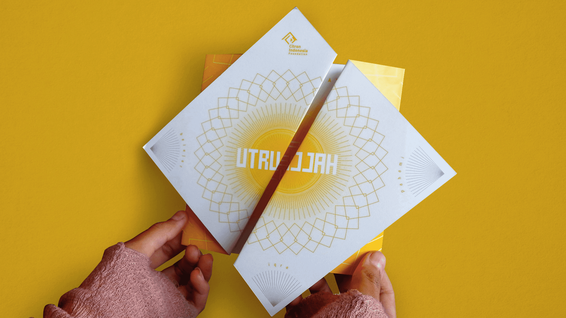
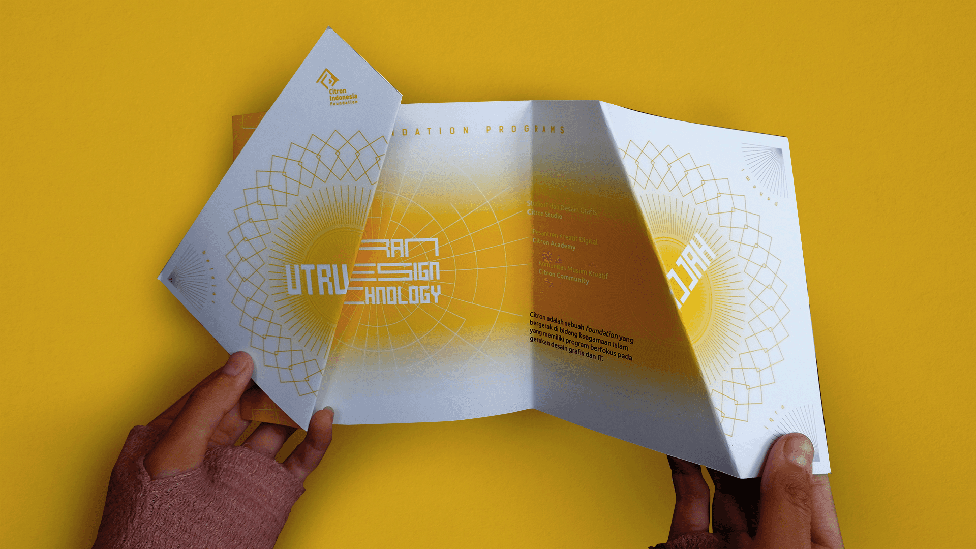
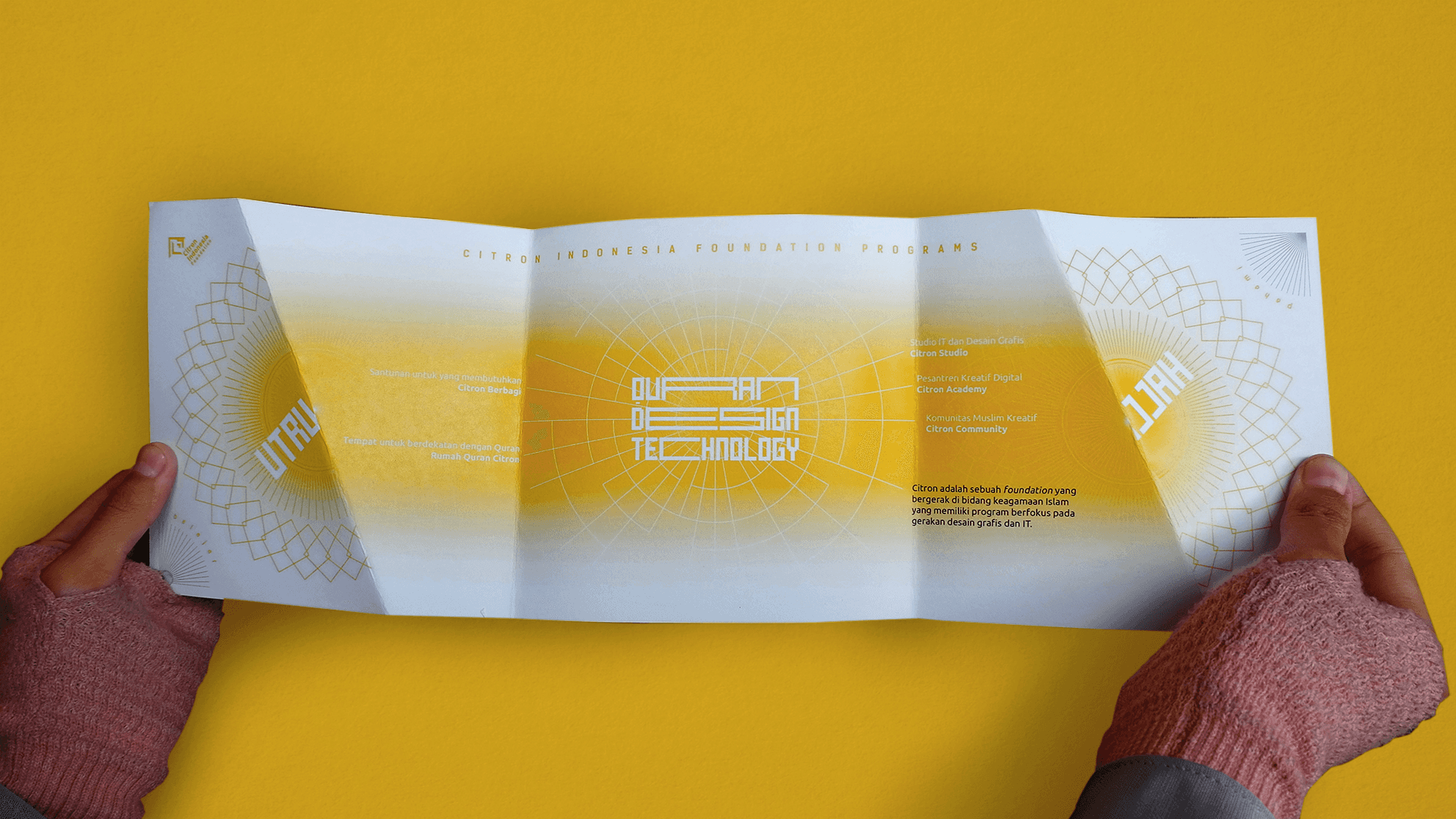
Postmodernism and Arabesque
Citron incorporates graphic elements inspired by Arabesque patterns, and the use of the Mecha font enhances both the Kufi calligraphy and a futuristic aesthetic simultaneously. In typography, a layout style embracing postmodernism.
Back to my portfolio list