
Paydia is a payment service provider with a wide range of products and services designed to make digital transactions hassle-free for users. In this case study, I will explain how I created the visual identity for Paydia as a brand.
COMPANY
Paydia Indonesia
INDUSTRY
Finance
YEAR
2023
SERVICE DELIVERED
Brand Identity
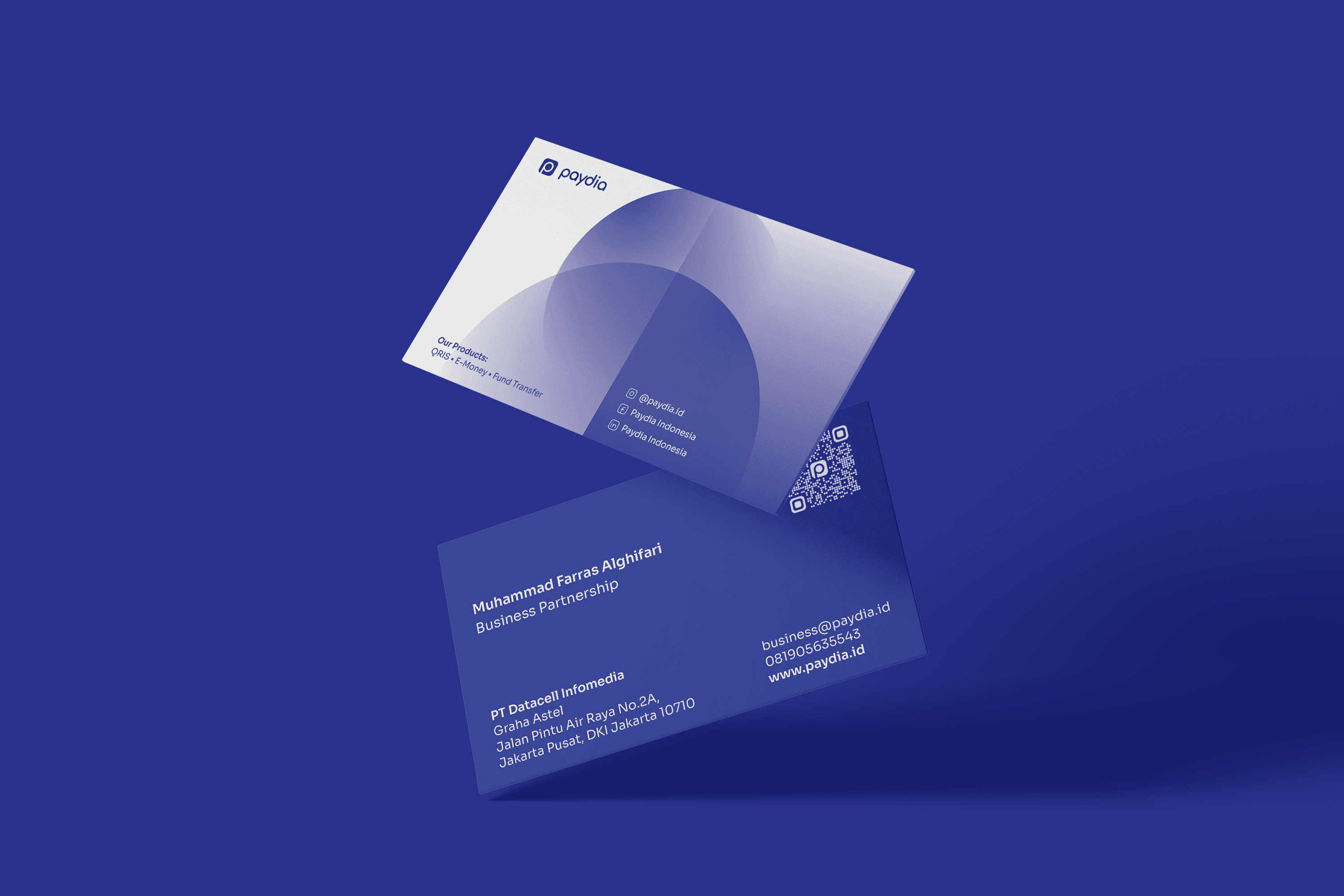
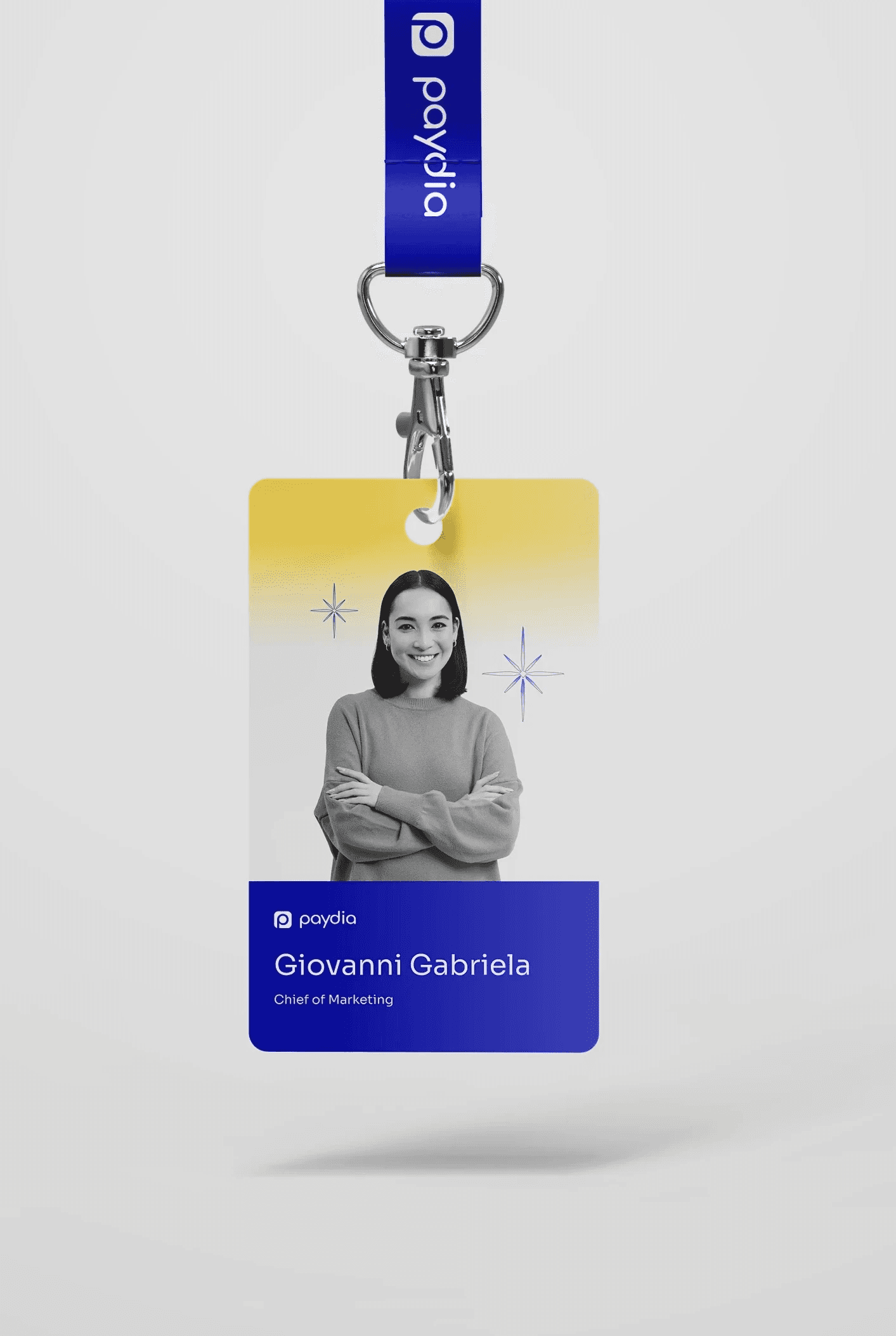
Stationary
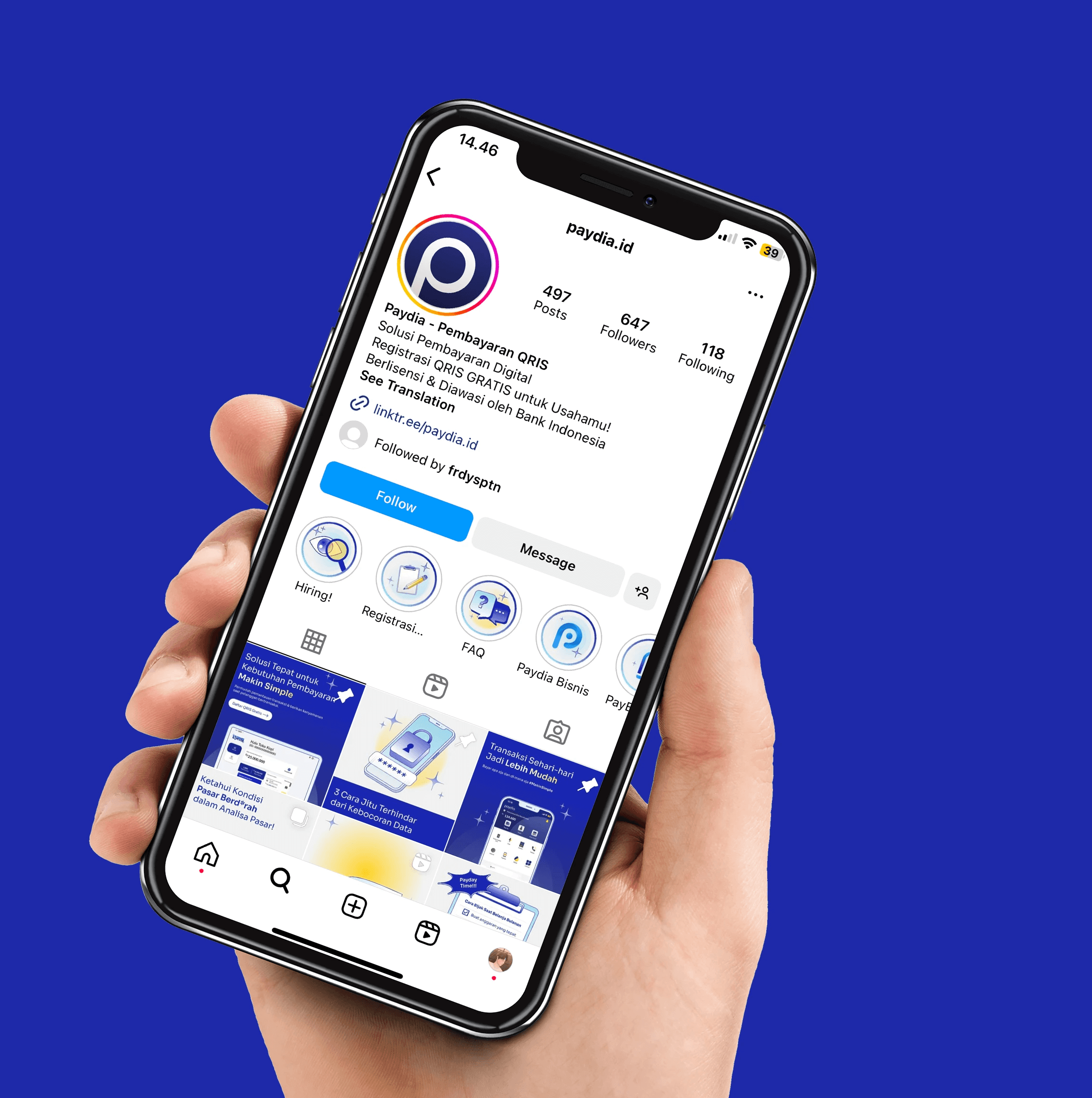
Social Media
Motion Graphic
Illustration
User Interface
Your Trusted Financial Companion
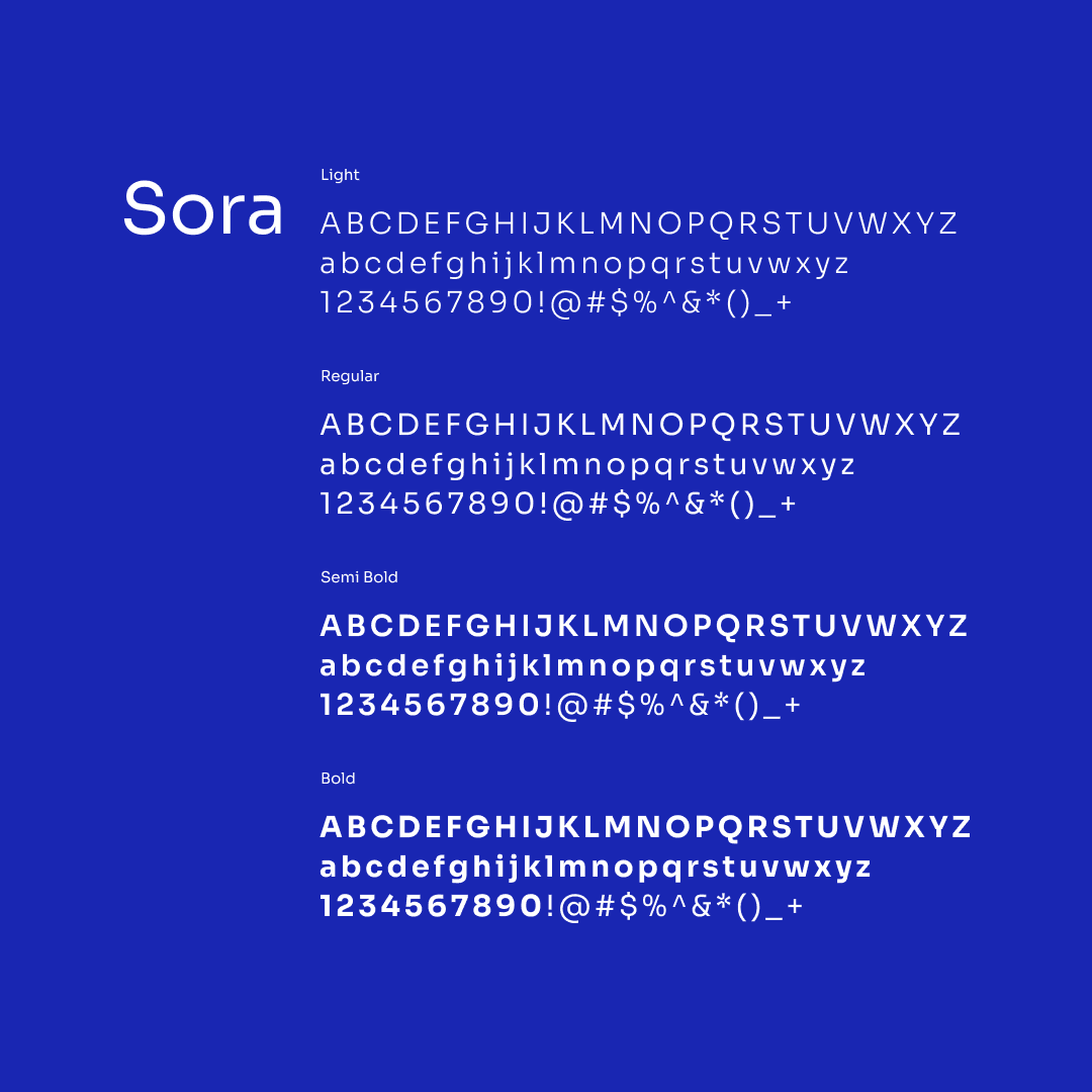
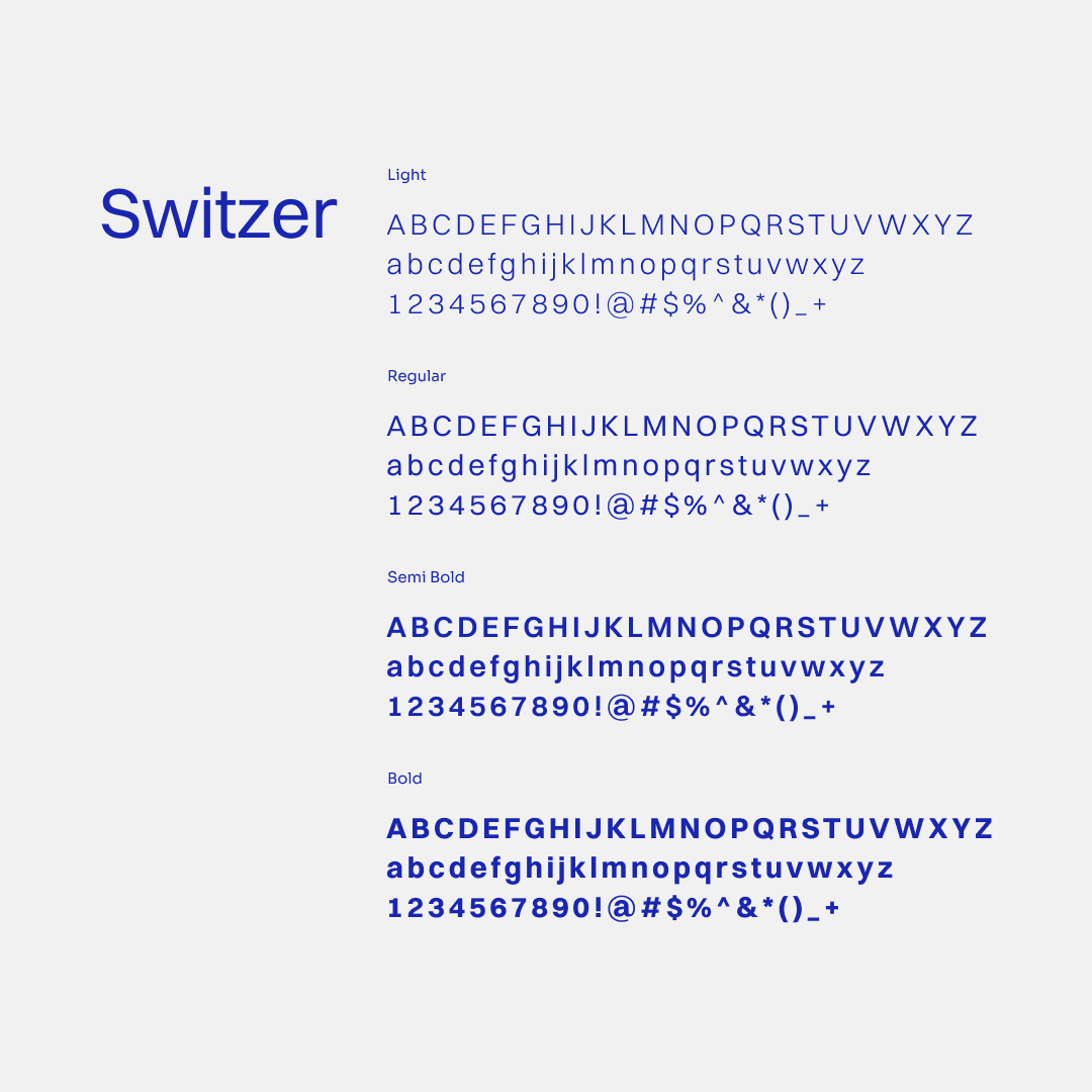
The idea we wanted to express with Paydia's identity is that of Paydia as a trustworthy friend to its users. As a result, our design comes a modern, easygoing, yet professional and credible appearance. We kept the color scheme from Paydia's before identity but updated it for a more modern and adaptable design. We used Sora as the primary typeface and Switzer as the secondary one for our typography. Sora's unique form provides personality to the identity, whereas Switzer has a more universal appeal that is suitable for UI design.
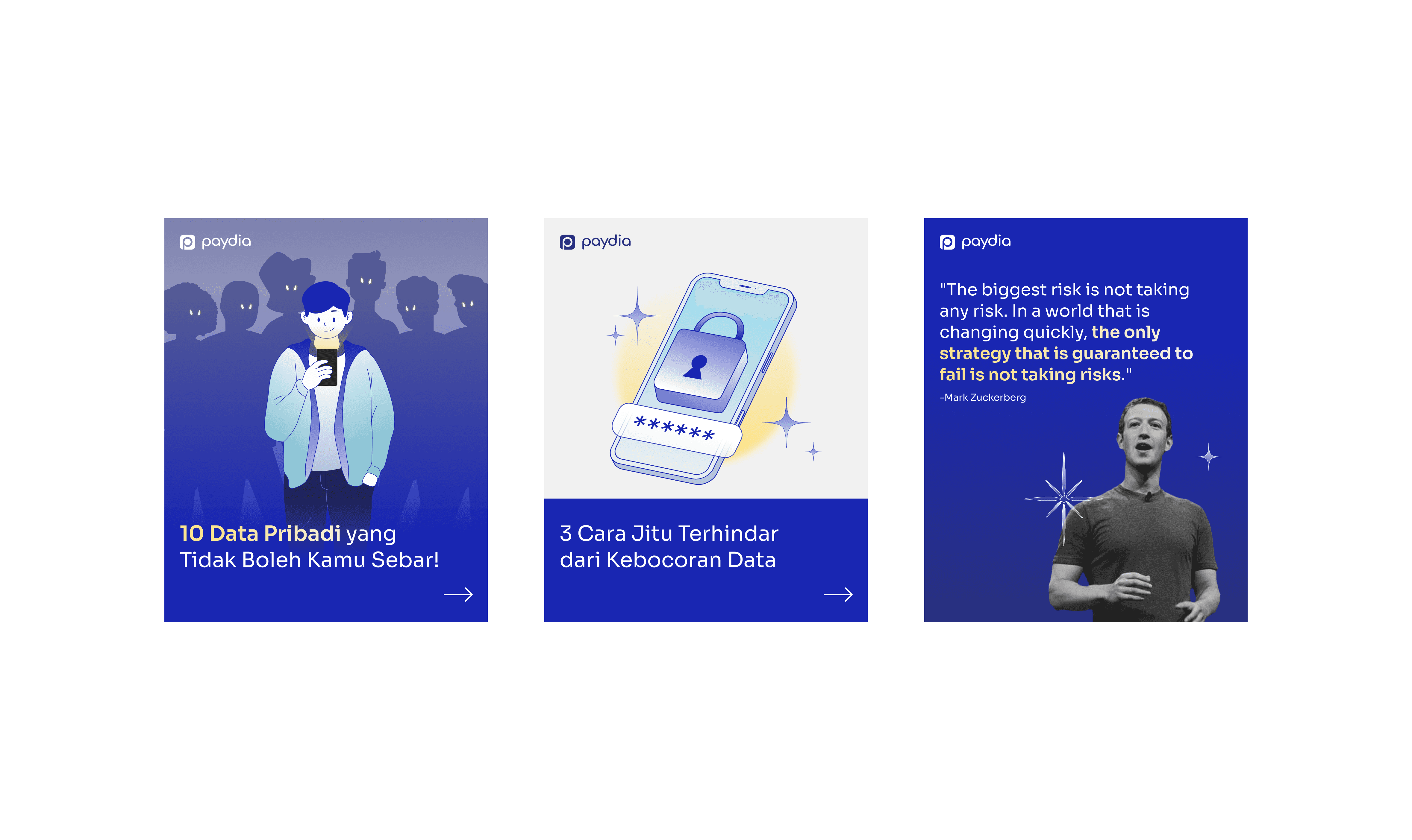
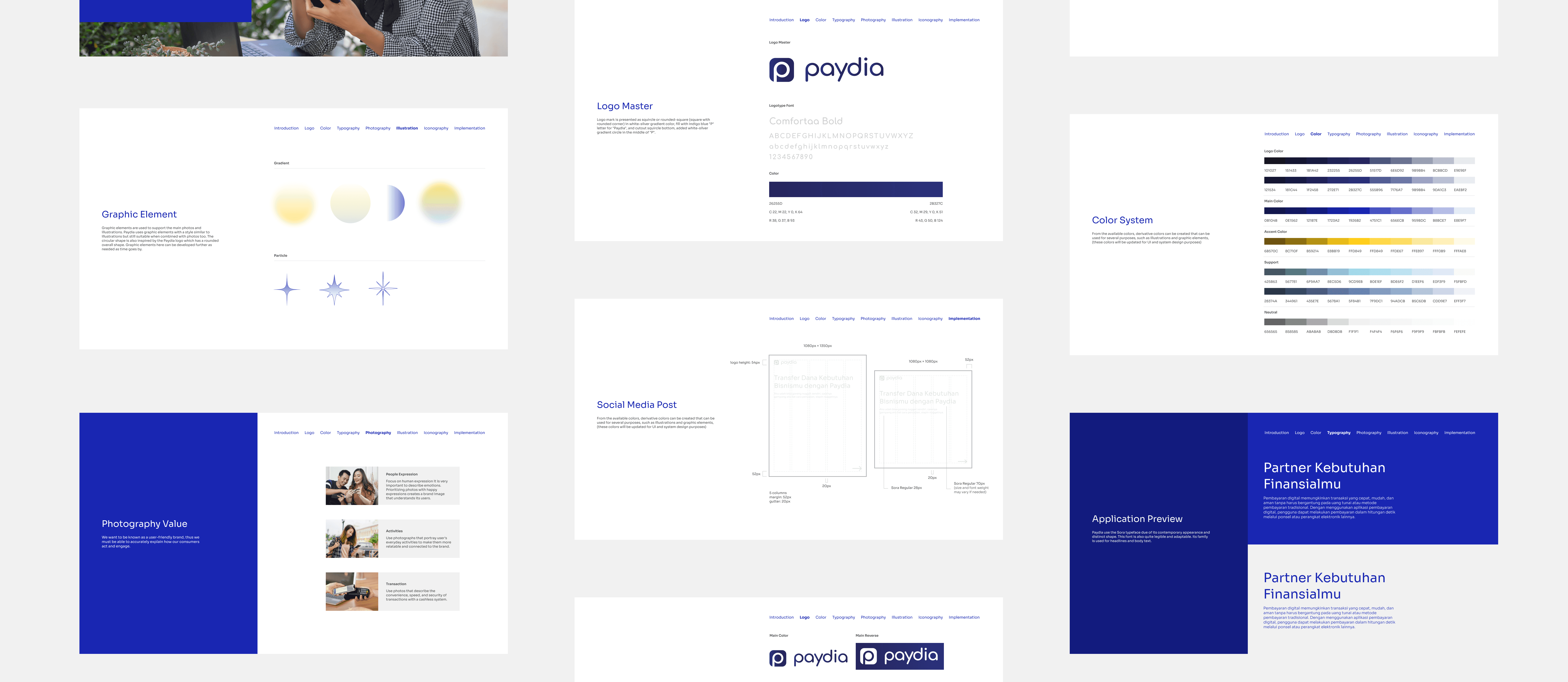
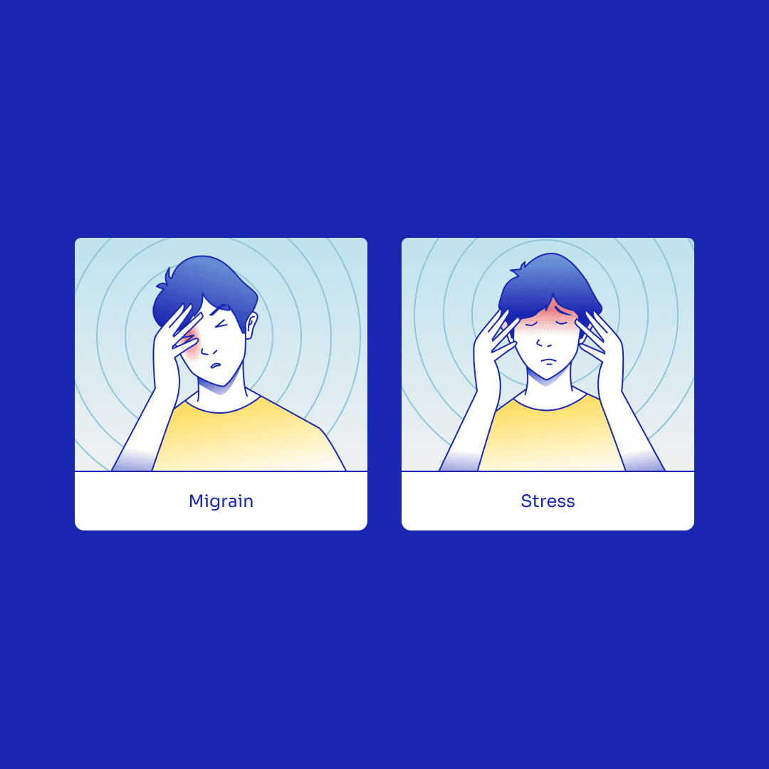
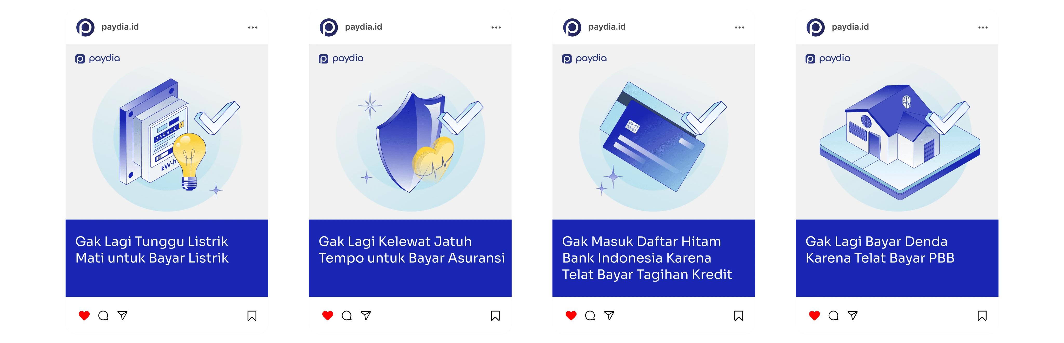
Playful Yet Inclusive
Paydia's illustration style adopts a simple comic-inspired approach, blending outlines with gradient fills. These illustrations are versatile and suitable for various mediums, including social media, printed materials, and digital product interfaces. Human characters are used as a bridge between Paydia and its users.


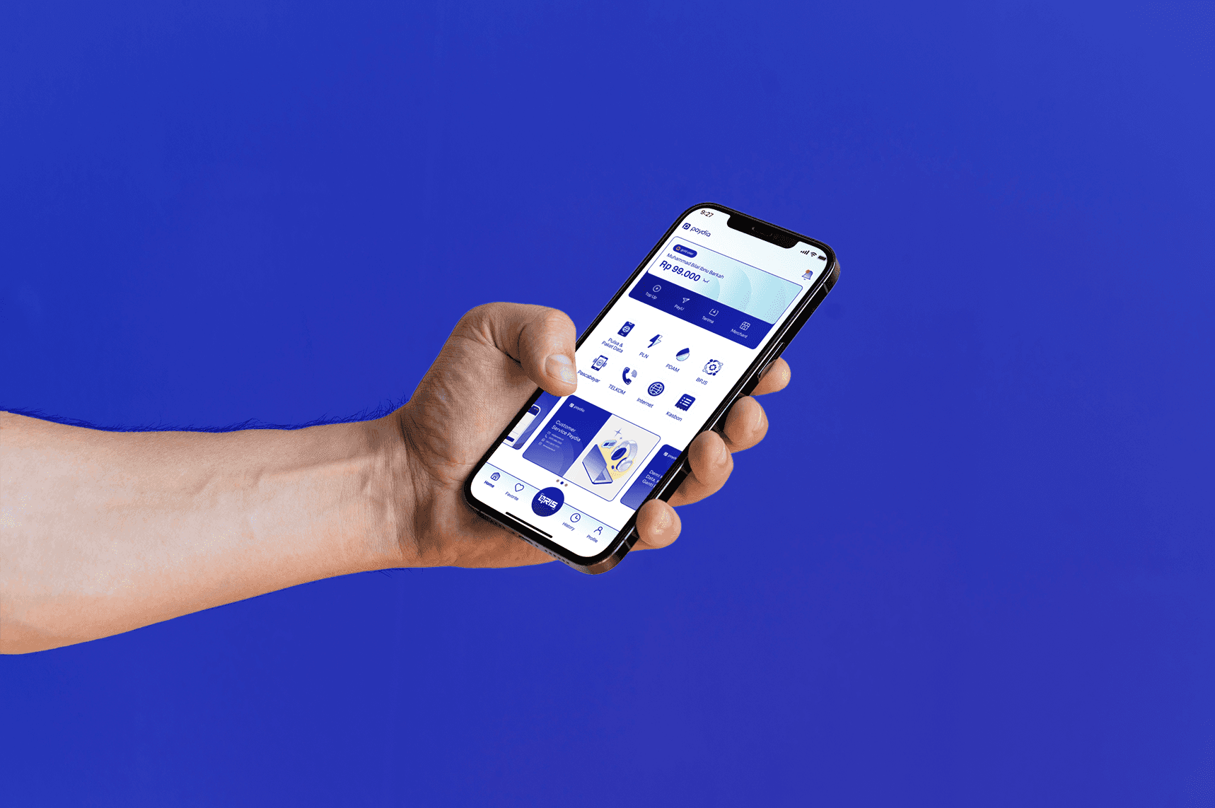
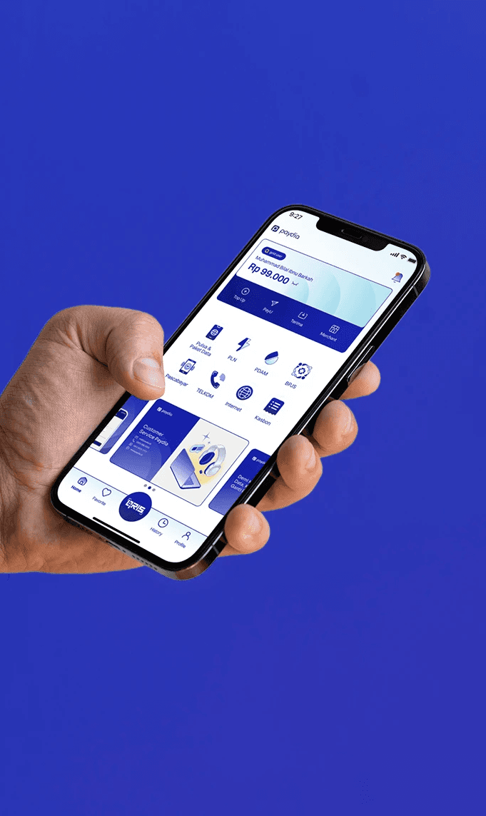
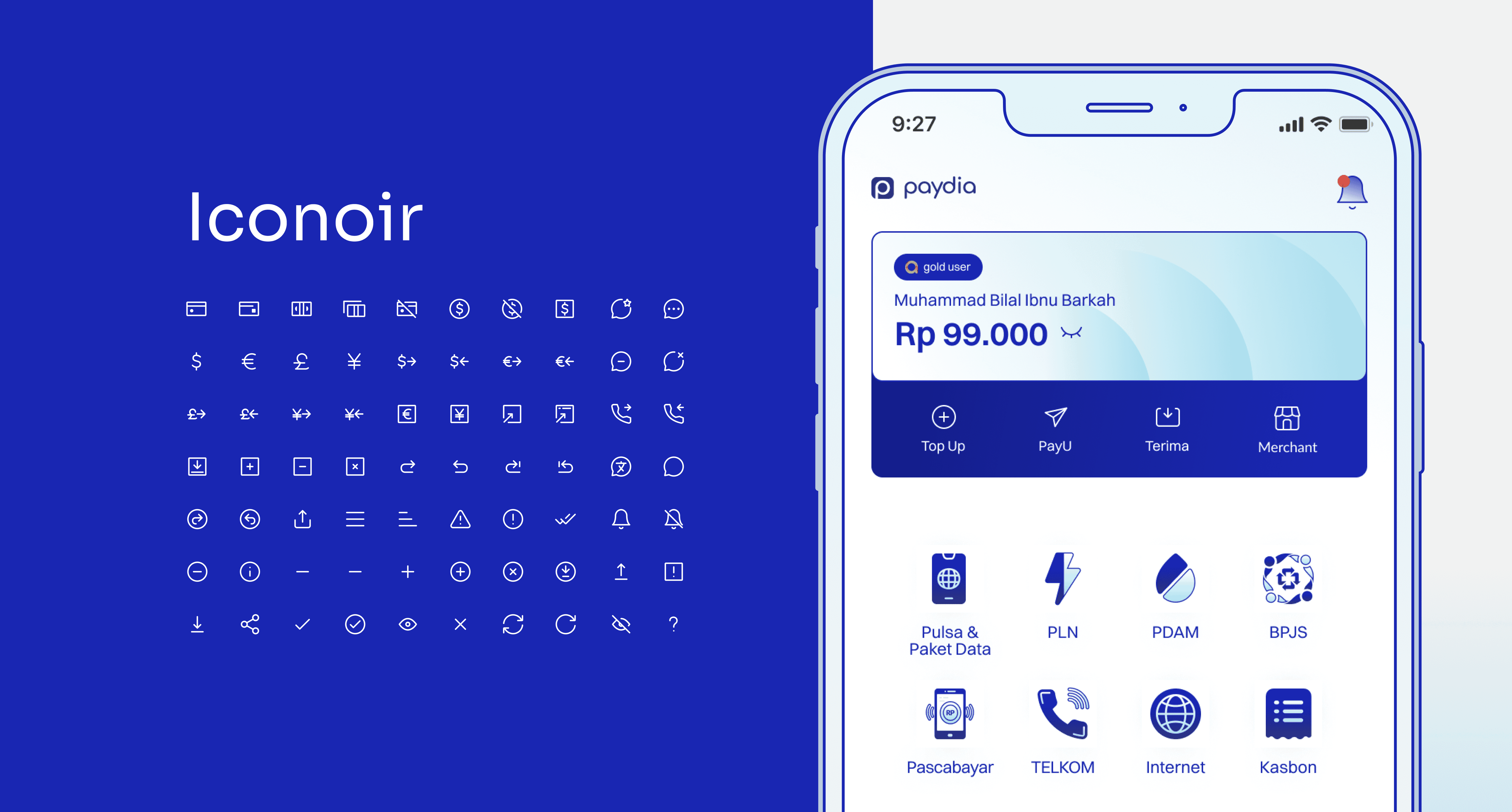
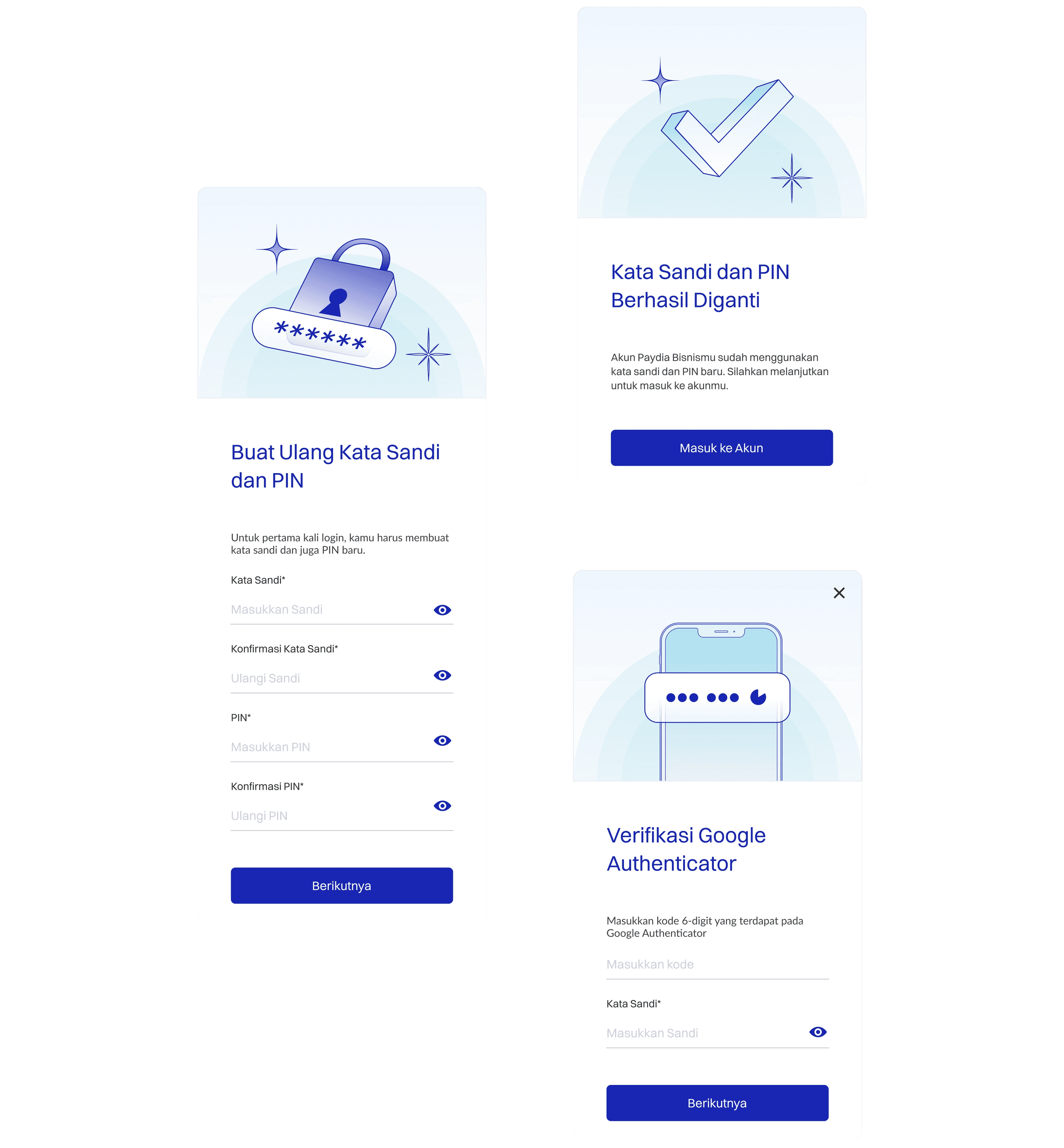
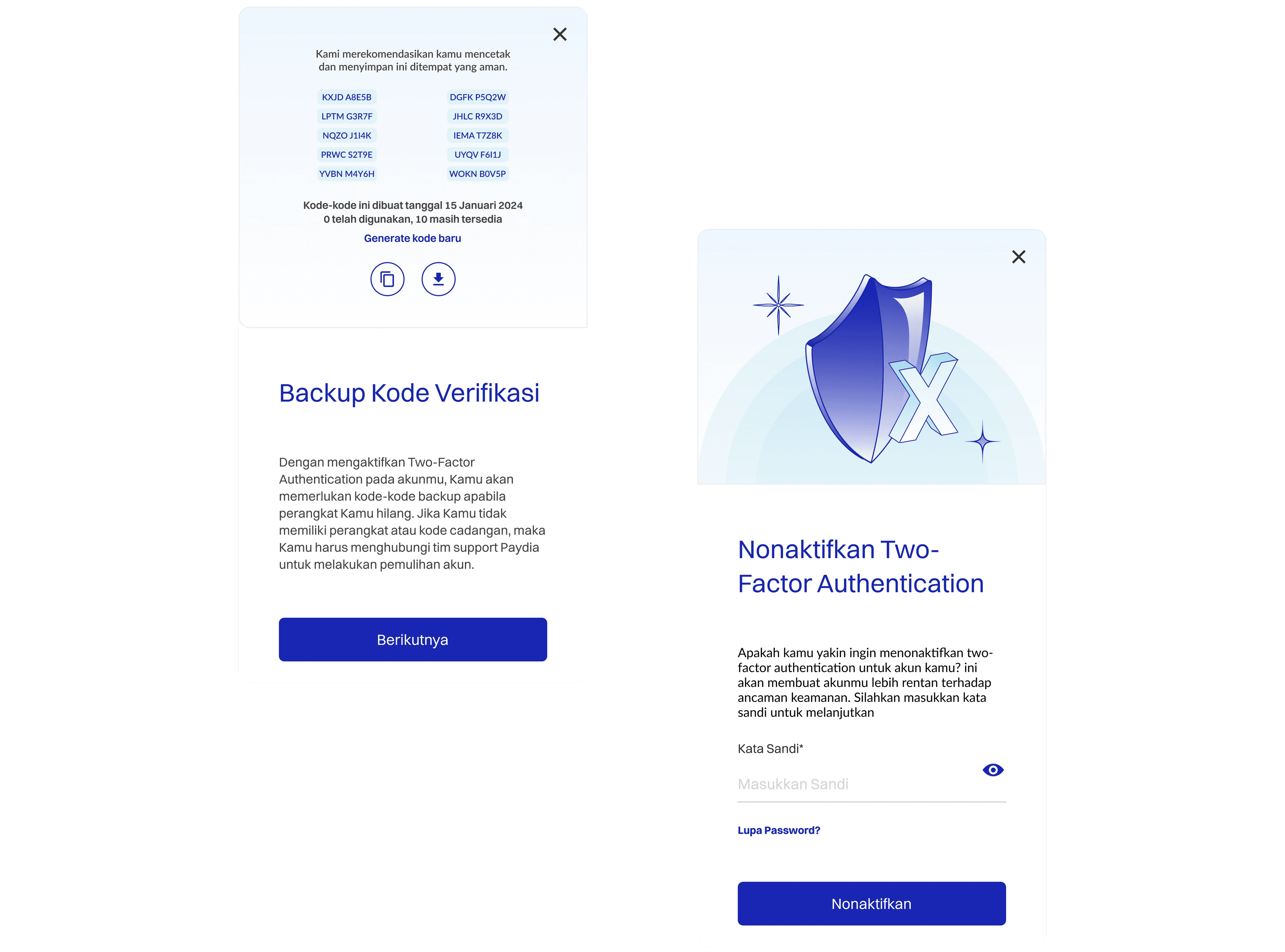
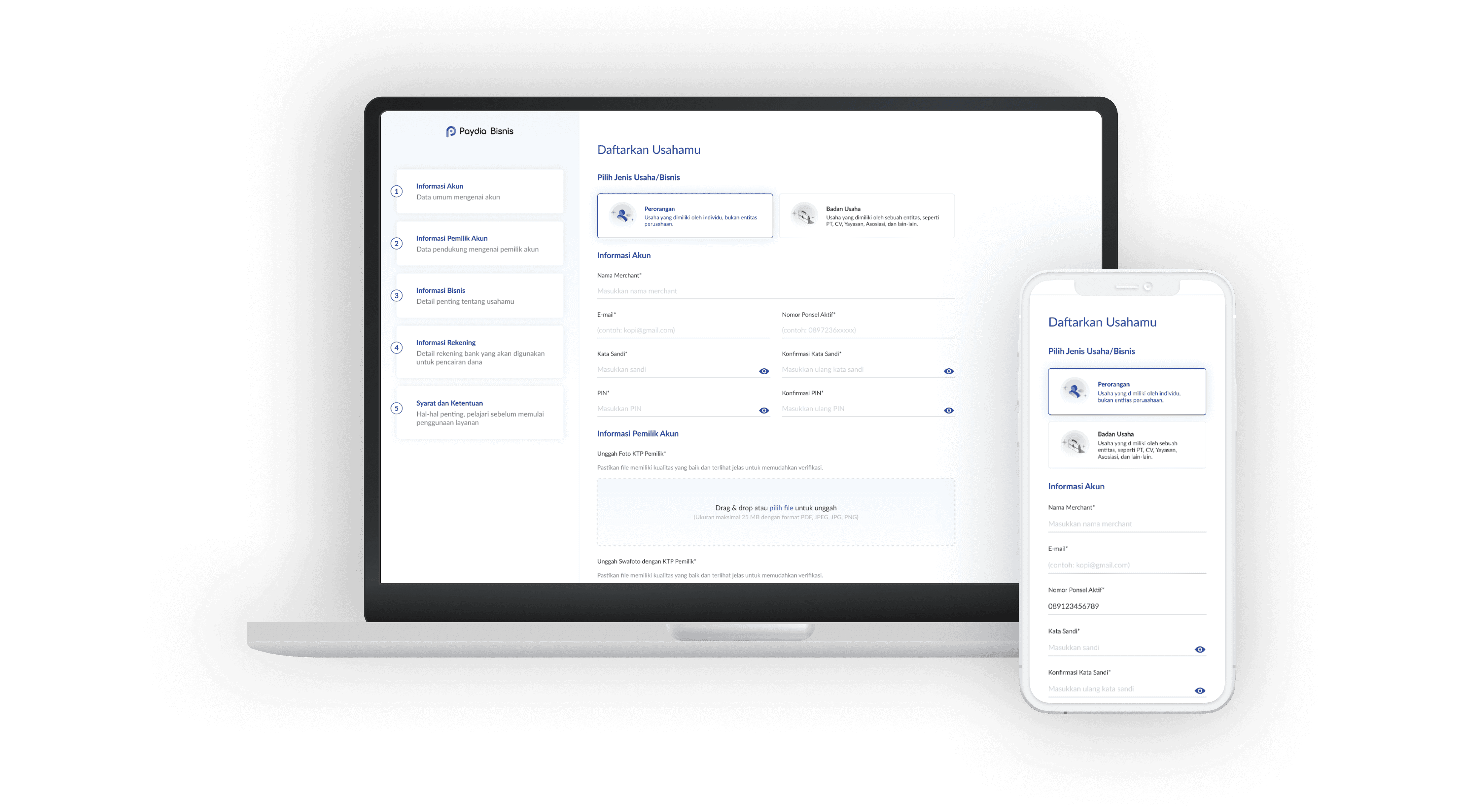
UI Implementation
Since Paydia is a digital company, its identity should also be implementable across a wide range of digital products, including mobile apps, the Merchant Dashboard, and the website.

Back to my portfolio list